전북대학교 통계학과 최규빈 교수님 강의 정리내용입니다.
https://guebin.github.io/DV2023/
Matplotlib
Boxplot
Boxplot의 장점: 단순히 평균을 주는 것보다 데이터를 파악하고 직관을 얻기에 유리하다.
y1=[75,75,76,76,77,77,78,79,79,98] # A선생님에게 통계학을 배운 학생의 점수들
y2=[76,76,77,77,78,78,79,80,80,81] # B선생님에게 통계학을 배운 학생의 점수들

print(f"A의 평균: {np.mean(y1)}, B의 평균: {np.mean(y2)}")
plt.boxplot([y1,y2]);
A의 평균: 79.0, B의 평균: 78.2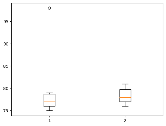
정규분포가정을 하는 법(데이터를 보고 어떻게 정규분포라고 알 수 있는가?): 데이터의 히스토그램을 그려서 종 모양이 되는지 확인해본다.
Histogram
히스토그램 : X축이 변수의 구간, Y축은 그 구간에 포함된 빈도를 의미하는 그림
y=[10,11,12,15,16,20,21,22,23,24,25]
plt.hist(y, bins=10, range=[0,30]);
# ;으로 결과 생략하기.
# bins : 가로축 구간의 갯수(막대의 갯수)
# range : 가로축의 범위 지정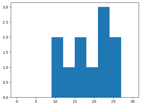
# 나란히 그리기
np.random.seed(77)
y1 = np.random.randn(10000)
y2 = np.random.randn(10000) + 0.5
plt.hist([y1,y2],bins=100);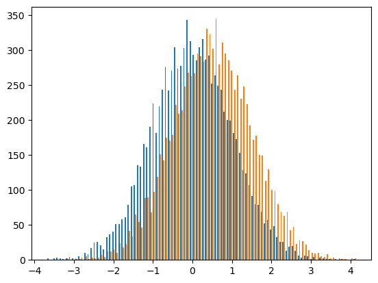
Histogram 응용 예제
!wget 주소: 주소에 있는 이미지를 다운로드
!rm 파일이름: 현재폴더에 “파일이름”을 삭제
다만 이런 명령어는 리눅스 기반에서 동작. 윈도우 환경에서는 동작하지 않는다.
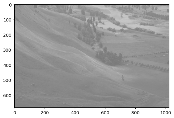
# 이미지를 rgb로 각각 분리하고 각 색깔들의 히스토그램을 그려보기.

r= img[:,:,0] # 빨강(R)
g= img[:,:,1] # 녹색(G)
b= img[:,:,2] # 파랑(B)

plt.hist(r.reshape(-1),bins=255,range=(0,255));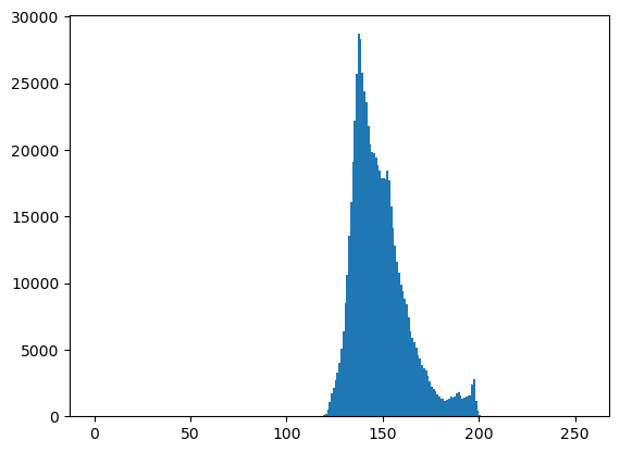
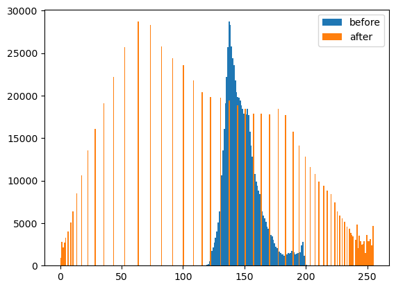
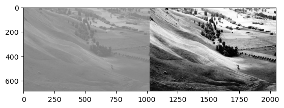
- cv2.equalizeHist()를 이용하여 분포의 모양은 대략적으로 유지하면서 값을 퍼트리자!
Line plot
- r–등의 옵션은 Markers + Line Styles + Colors 의 조합으로 표현가능
ref: https://matplotlib.org/stable/api/_as_gen/matplotlib.pyplot.plot.html
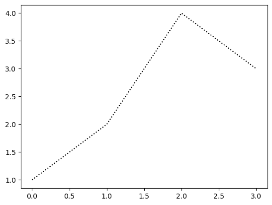
--r: 점선(dashed)스타일 + 빨간색r--: 빨간색 + 점선(dashed)스타일:k: 점선(dotted)스타일 + 검은색k:: 검은색 + 점선(dotted)스타일
Line Styles
| character | description |
|---|---|
| ‘-’ | solid line style |
| ‘–’ | dashed line style |
| ‘-.’ | dash-dot line style |
| ‘:’ | dotted line style |
Colors
| character | color |
|---|---|
| ‘b’ | blue |
| ‘g’ | green |
| ‘r’ | red |
| ‘c’ | cyan |
| ‘m’ | magenta |
| ‘y’ | yellow |
| ‘k’ | black |
| ‘w’ | white |
Markers
| character | description |
|---|---|
| ‘.’ | point marker |
| ‘,’ | pixel marker |
| ‘o’ | circle marker |
| ‘v’ | triangle_down marker |
| ‘^’ | triangle_up marker |
| ‘<’ | triangle_left marker |
| ‘>’ | triangle_right marker |
| ‘1’ | tri_down marker |
| ‘2’ | tri_up marker |
| ‘3’ | tri_left marker |
| ‘4’ | tri_right marker |
| ‘8’ | octagon marker |
| ‘s’ | square marker |
| ‘p’ | pentagon marker |
| ‘P’ | plus (filled) marker |
| ’*’ | star marker |
| ‘h’ | hexagon1 marker |
| ‘H’ | hexagon2 marker |
| ‘+’ | plus marker |
| ‘x’ | x marker |
| ‘X’ | x (filled) marker |
| ‘D’ | diamond marker |
| ‘d’ | thin_diamond marker |
| ‘|’ | vline marker |
| ’_’ | hline marker |
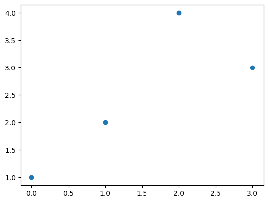
Scatter plot
마커를 설정하면 끝
색깔변경
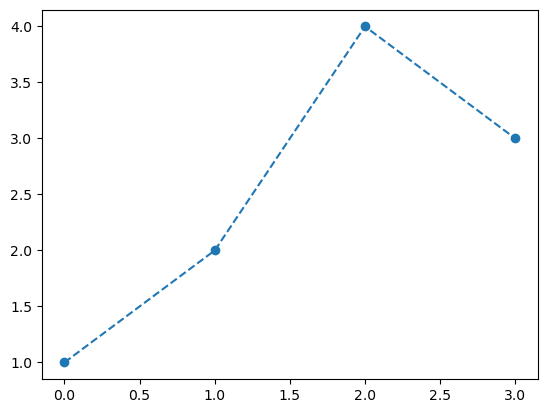
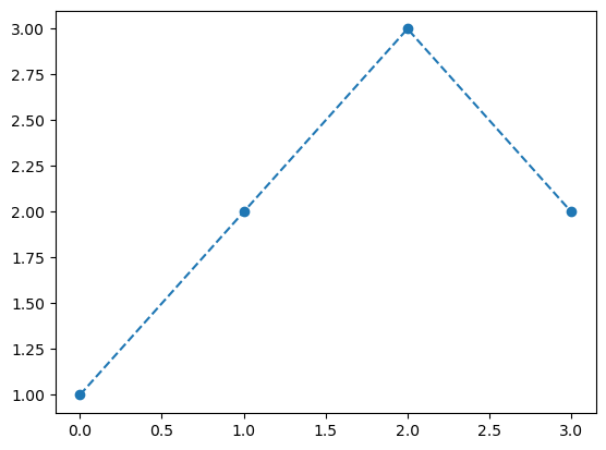
dot-connected plot
마커와 라인스타일을 동시에 사용하면 dot-connected plot이 된다.

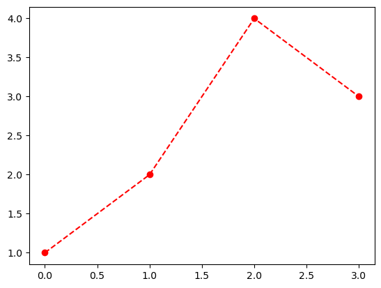
순서를 바꿔도 상관없다.
ex) --or r--o 등..
겹쳐 그리기
객체지향적 시각화
그림을 저장했다가 꺼내보고싶다. 그림을 그리고 저장하자.

다른그림을 그려보자.
저장한 그림은 언제든지 꺼내볼 수 있음
plt.plot 쓰지 않고 그림 그리기
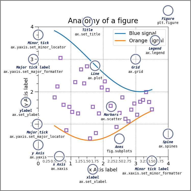
계층구조: Figure \(\supset\) [Axes,…] \(\supset\) YAxis, XAxis, [Line2D,…]
개념: - Figure(fig): 도화지 - Axes(ax): 도화지에 존재하는 그림틀 - Axis, Lines: 그림틀 위에 올려지는 물체(object)
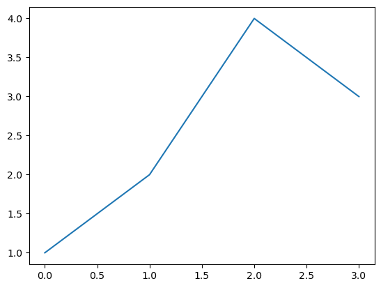
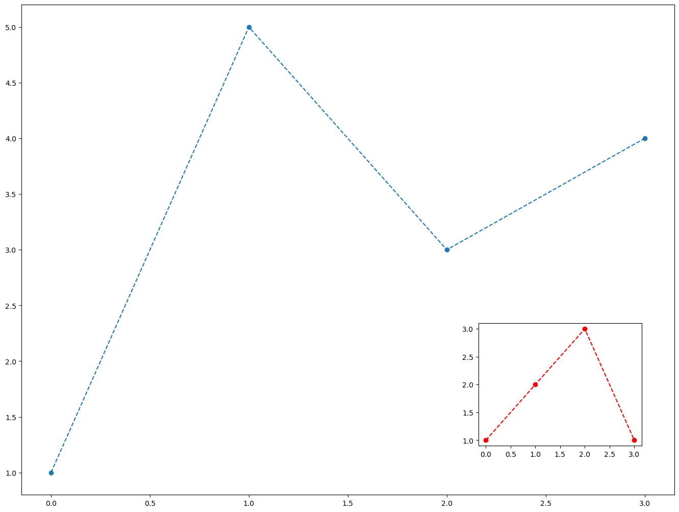
- 목표: 아래와 똑같은 그림을 plt.plot()을 쓰지 않고 만든다.

Figure
이 과정은 사실 클래스 -> 인스턴스의 과정임 (plt라는 모듈안에 Figure라는 클래스가 있는데, 그 클래스에서 인스턴스를 만드는 과정임)
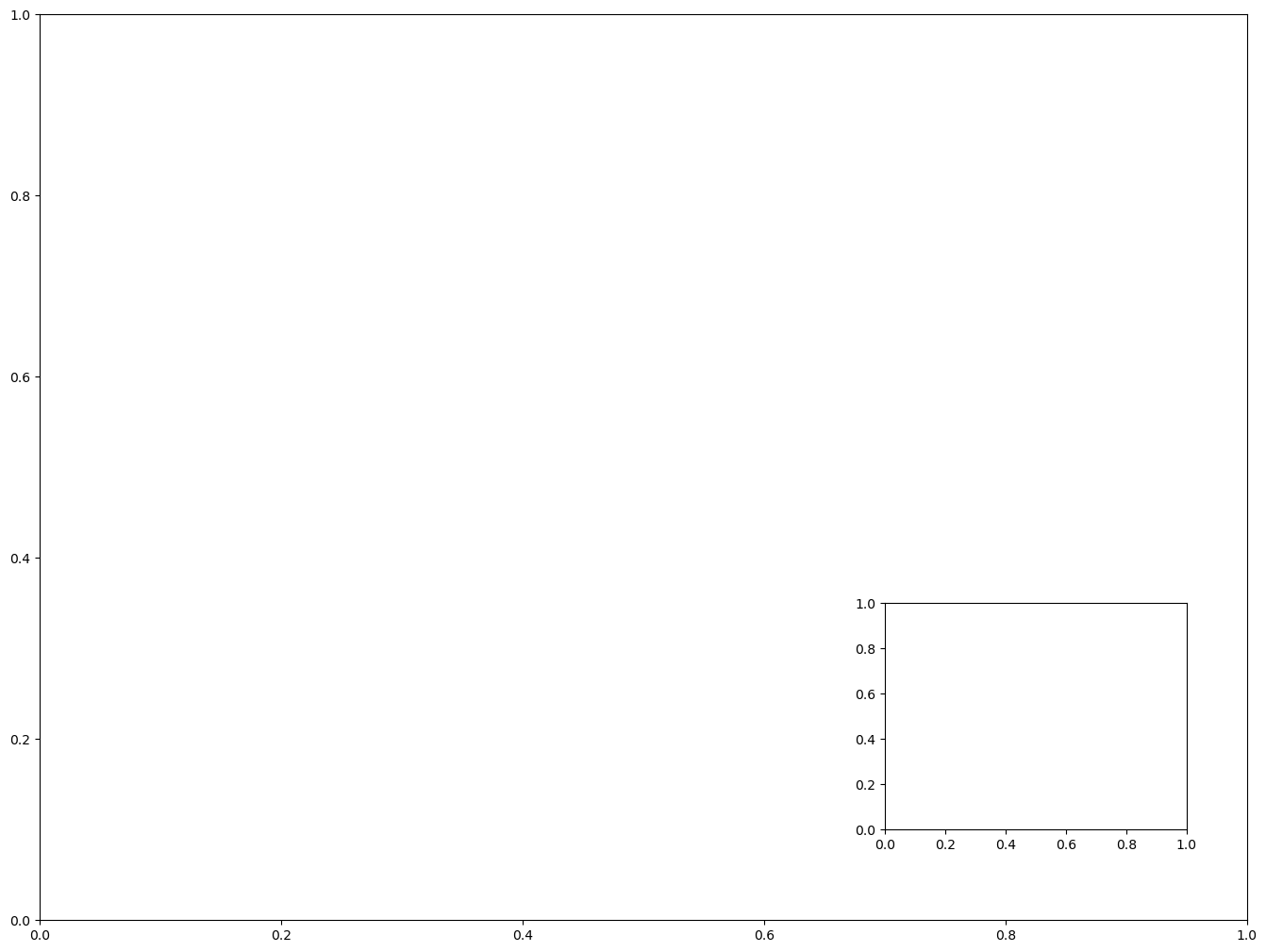
Axes
fig.add_axes는 fig에 소속된 함수이며, 도화지에서 그림틀을 ‘추가하는’ 함수이다.
Axes 조정
Line

미니맵
Subplot
plt.subplots()
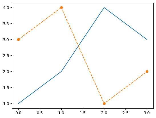
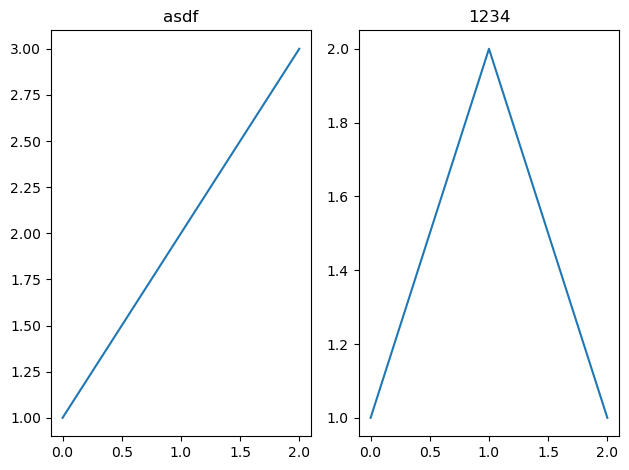
- 예시 1
# fig, axs = plt.subplots(2)
fig, (ax1,ax2) = plt.subplots(2,figsize=(4,4))
ax1.plot([1,2,3,2],'--r')
ax2.plot([1,2,4,3],'--o')
fig.tight_layout()
# plt.tight_layout()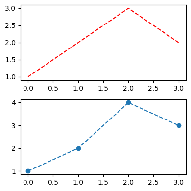
- 예시 2
Title
plt
fig
fig,(ax1,ax2) = plt.subplots(1,2)
ax1.set_title('asdf')
ax2.set_title('1234')
fig.suptitle('asdf1234')
fig.tight_layout()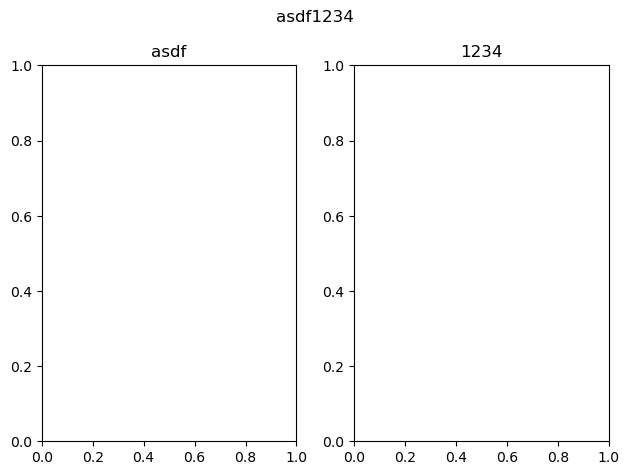
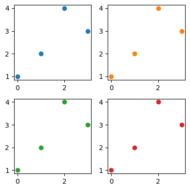
fig, ((ax1, ax2, ax3), (ax4, ax5, ax6)) = plt.subplots(2,3)
x,y = [1,2,3,4], [1,2,4,3]
ax1.plot(x,y, 'ro')
ax2.plot(x,y, 'go')
ax3.plot(x,y, 'bo')
ax4.plot(x,y, 'ro--')
ax5.plot(x,y, 'go--')
ax6.plot(x,y, 'bo--')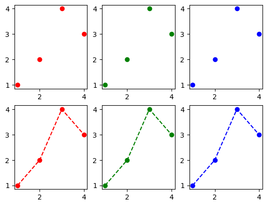
Summary
- 라인플랏: 추세
- 스캐터플랏: 두 변수의 관계
- 박스플랏: 분포(일상용어)의 비교, 이상치
- 히스토그램: 분포(통계용어)파악
- 바플랏: 크기비교
예시 작성
그래프 여러개 그리기 - plt.subplots()
- 한 공간에 여러개의 그래프를 그려야할때는 그냥
Text(0.5, 1.0, 'Sin & Cos')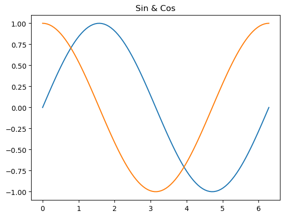
와 같이 그래프 여러개를 써주면 됨.
여러개의 그래프를 다른 공간에 그려야할때는 plt.subplots(행,열)
fig, (ax1, ax2) = plt.subplots(1,2, figsize=(8,4))

ax1.plot(x, np.sin(x));
ax2.plot(x, np.cos(x), color='C1');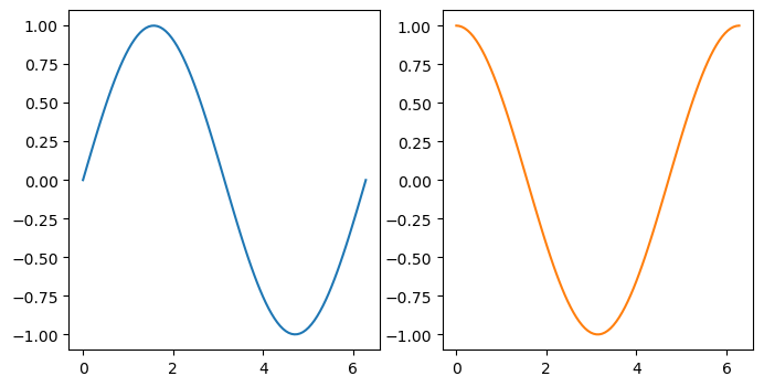
- 여러 행일때는?? 행 단위로 한번 더 묶어준다.
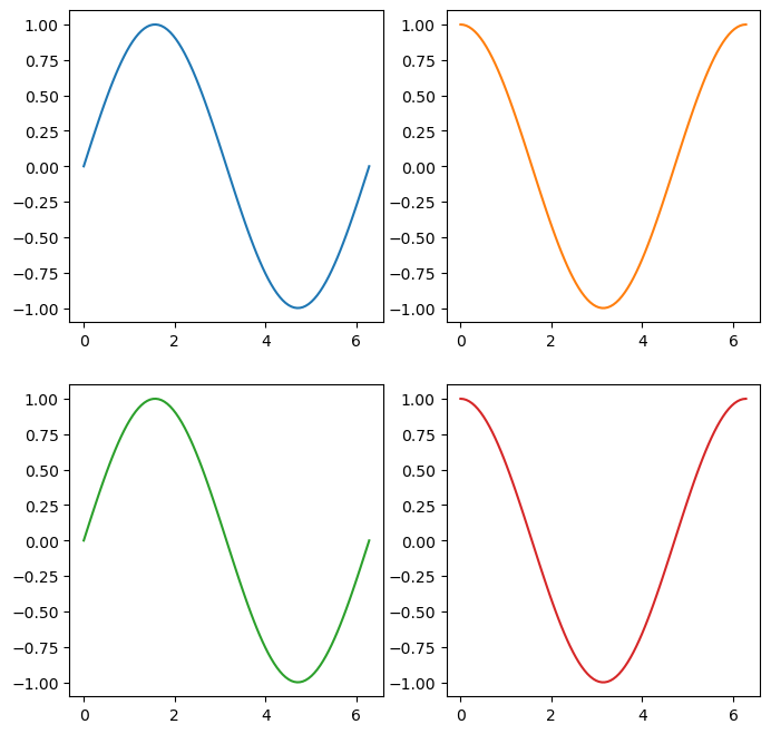
제목설정 - ax.set_title(" "), fig.suptitle(" ")
- 각각의 그래프에 이름을 달고싶다.
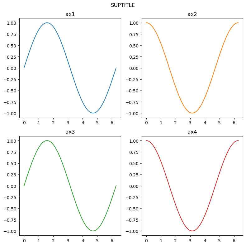
fig, ((ax1, ax2), (ax3, ax4)) = plt.subplots(2,2, figsize=(8,8))

ax1.plot(x, np.sin(x));
ax2.plot(x, np.cos(x), color='C1');
ax3.plot(x, np.sin(x), color='C2');
ax4.plot(x, np.cos(x), color='C3');
ax1.set_title('ax1')
ax2.set_title('ax2')
ax3.set_title('ax3')
ax4.set_title('ax4')
fig.suptitle("SUPTITLE") # 전체 타이틀.
fig.tight_layout() # 레이아웃을 타이트하게.