전북대학교 통계학과 최규빈 교수님 강의 정리내용입니다.
https://guebin.github.io/DV2023/
import
Seaborn
- 개념차이
- matplotlib: 벡터 친화적
- seaborn: 데이터프레임 친화적
- 데이터프레임 친화적인 시각화 툴이 왜 강력한가?
분석할 데이터가 tabula data 형식인 경우가 많다. matplotlib은 여전히 강력하지만, seaborn등 데이터프레임 친화적 패키지가 우수한 경우가 많다.
df = pd.read_csv("https://raw.githubusercontent.com/guebin/DV2023/main/posts/titanic.csv")
df.head()| PassengerId | Survived | Pclass | Name | Sex | Age | SibSp | Parch | Ticket | Fare | Cabin | Embarked | logFare | |
|---|---|---|---|---|---|---|---|---|---|---|---|---|---|
| 0 | 1 | 0 | 3 | Braund, Mr. Owen Harris | male | 22.0 | 1 | 0 | A/5 21171 | 7.2500 | NaN | S | 1.981001 |
| 1 | 2 | 1 | 1 | Cumings, Mrs. John Bradley (Florence Briggs Th... | female | 38.0 | 1 | 0 | PC 17599 | 71.2833 | C85 | C | 4.266662 |
| 2 | 3 | 1 | 3 | Heikkinen, Miss. Laina | female | 26.0 | 0 | 0 | STON/O2. 3101282 | 7.9250 | NaN | S | 2.070022 |
| 3 | 4 | 1 | 1 | Futrelle, Mrs. Jacques Heath (Lily May Peel) | female | 35.0 | 1 | 0 | 113803 | 53.1000 | C123 | S | 3.972177 |
| 4 | 5 | 0 | 3 | Allen, Mr. William Henry | male | 35.0 | 0 | 0 | 373450 | 8.0500 | NaN | S | 2.085672 |
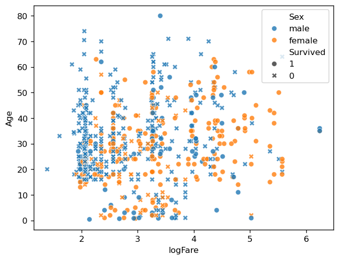
sns.scatterplot(
    df,
    x='logFare',
    y='Age',
    hue='Sex',
    style='Survived',style_order=[1,0],
    alpha=0.8
)
sns.scatterplot(
    df,
    x='logFare',
    y='Age',
    hue='Sex',
    style='Survived',style_order=[1,0],
    alpha=0.8
)
fig = plt.gcf()
ax = plt.gca()
ax.set_title('Scatter Plot')
fig.add_axes([0.6,0.2,0.25,0.25])
ax_mini = plt.gca()
ax_mini.hist(df.Age)
ax_mini.hist(df.Age[df.Survived==1])
ax_mini.set_title('Histogram')
fig.suptitle('TITANIC')
Text(0.5, 0.98, 'TITANIC')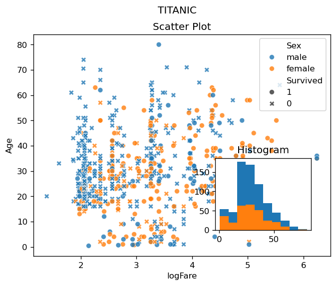
- 간단한 시각화는 matplotlib이 유리.
- 보통 matplotlib이 더 본질적인 이해를 도와준다. 즉 seaborn에 대한 아주 고급기능은 오히려 matplotlib에 대한 통찰이 있어야 가능하다.
- plotly가 모든면에서 seaborn을 압도하는 추세.
2의 예시
sns.scatterplot(
    df,
    x='logFare',
    y='Age',
    hue='Sex',
    style='Survived',style_order=[1,0],
    alpha=0.8
)
fig = plt.gcf()
ax = plt.gca()
ax.set_title('Scatter Plot')
fig.add_axes([0.6,0.2,0.25,0.25])
ax_mini = plt.gca()
ax_mini.hist(df.Age)
ax_mini.hist(df.Age[df.Survived==1])
ax_mini.set_title('Histogram')
fig.suptitle('TITANIC')
Text(0.5, 0.98, 'TITANIC')
그림은 seaborn으로 그렸지만, 여기에 타이틀 등을 추가하고 싶을 때 matplotlib을 이용하여 수정.